The Dorcas Centre
- Mar 30, 2013
- 1 min read
For some reason, in the last few months a number of people have been talking to me about new business ventures like new fashion labels they are about to release. In these conversations, I have been emphasising the importance of a brand/company’s visual identity. I am talking about the complete visual package from print, to online, office/store presentation and so forth. I believe that when the visual identity is created well, maintained and refreshed effectively, it resonates with people and extrudes a high level of professionalism.
I recently saw the new visual identity for the Dorcas Centre by London based design studio Confederation. Dorcas Centre is an educational facility set up by Elizabeth Oubda to help women in poverty living in and around Bobo-Dioulasso in Burkina Faso. I will be name dropping the Dorcas Centre the next time I have a conversation with someone about their new business venture and visual identity.
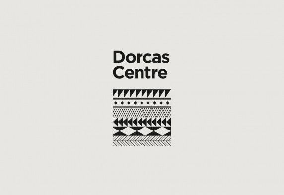
The Dorcas Centre’s brief was to create a visual language which would attract local and global funders. In response, Confederation created a contemporary, black and white brand pattern, inspired by the traditional paintwork known as Gourounsi found on many of the houses around Bobo-Dioulasso. The pattern was applied to their updated digital and printed material accompanied by optimistic images of those directly involved with the centre.


SOURCE: CREATIVE ROOTS & DORCAS CENTRE


Comments